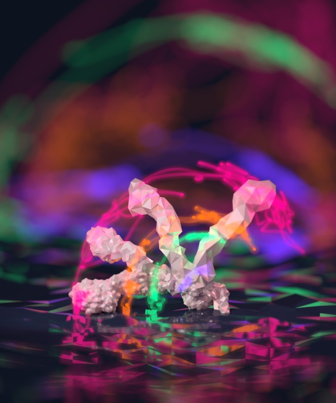
The BPS Art of Science Image Contest took place again this year, during the 60th Annual Meeting in Los Angeles. The image that won second place was submitted by Thomas Newport, a PhD student at the University of Oxford. His image shows simulated dynamics of the ectodomain of the receptor tyrosine kinase EphA2 (shown as glowing lines) as well as different conformations that highlight the possible movement of this receptor relative to the membrane surface. Newport writes here about the image and the science it represents, as well as his experience as a first-time BPS Annual Meeting attendee.
The Biophysical Society’s 2016 meeting was unlike any other conference I have attended in my admittedly fairly short academic career. Thousands of posters, talks, and exhibits clamour for attention over a packed six day schedule. Distinguished professors haggle over conclusions with terrified grad students, while suited salespeople draw in new customers with the promise of free bags, USB drives, and flat-pack microscopes.
Probably the highlight of this, my first Biophysical Society meeting, was winning second prize in the Art of Science image competition, or as my supervisor helpfully emailed me a few minutes later, “congratulations, you’ve won second prize in a beauty contest, collect $10.” The competition: ten gorgeous images, some computer generated, some from microscopes, telling a selection of stories from across the vast field of biophysics.
My image was developed in collaboration with Matthieu Chavent, and shows simulated motions of a key signalling protein as it interacts with the cell membrane. His paper explains more of the scientific background and is well worth a read. Matthieu had already visualised the protein using VMD, a popular open source visualisation tool for molecular dynamics simulations, and traced the paths followed by several atoms as the protein moved between two states. By this point my enthusiasm for digital art and 3D visualisation was fairly well known so we met up to discuss turning this data into art.
Blender3D has been my tool of choice for 3D digital art since I was in high school. It’s open source, has great developer and user communities, and can be used for anything from game development to movie production. Working on the data in Blender gave me complete control of the scene, letting me get the composition, lighting and materials just right. I drew inspiration from long-exposure “light painting” photography, where movement can be captured using trails of light. The light trails were probably the most difficult part to get right – transparent and glowing enough to look ethereal but clear enough to be easy to follow.
It seems to have been a hit – the image has been used as the cover of Structure journal and even appeared on the 2015 Biochemistry Department Christmas card (Matthieu even photoshopped some festive hats onto the proteins, although sadly they didn’t make it to the final card). I’ve run a couple of courses teaching Blender to structural biologists, and it definitely seems like a few people were put off by easily fixable data compatibility issues. Once I’ve got a moment free I’d really like to improve the way Blender handles structural biology data to take some of the data wrangling out of developing scientific art. If you’d like to help, you can find me on GitHub or Twitter (@tnewport).
Concepts in biophysics and structural biology are often most effectively communicated through images, from the iconic double helix of DNA to Jane Richardson’s now ubiquitous protein ribbon diagrams. New technologies are creating new ways for us to tell scientific stories in visual media, as still images, videos, and interactivities. This year’s BPS Art of Science competition showcased some amazing works of art that have come out of these advances, and I’m looking forward to an even tougher competition next year.
